A Halloween event website can feel atmospheric and still answer practical questions quickly. Visitors may arrive because they saw a photograph, heard about a display, or want to plan a visit. They need to understand what the experience is, where current information lives, and how to explore the story. The website succeeds when its visual character helps those tasks rather than hiding them.
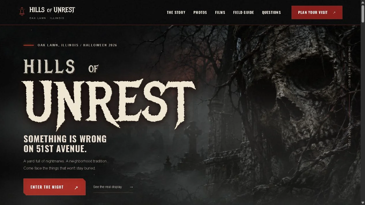
Hills of Unrest is a portfolio website for a Halloween yard display in Oak Lawn, Illinois, with real display photographs, films, and visitor information. The project is listed among Dinks Gaming’s web work. This guide concerns website design; it does not attribute the physical display, its history, or its creators’ achievements to Alex Koch.
Plan for visitors with different questions
Someone discovering the display wants a clear introduction. Someone planning a visit wants practical details. Someone already familiar with it may want photographs, films, or the evolving story. These journeys can share one site without requiring the same opening sequence for everyone.
Name the primary question for each major page. A visitor guide should explain the visit. A gallery should help people explore authentic media. A story page can develop the setting in more depth. Clear page roles make the site easier to navigate and maintain.
Use an obvious route from the atmospheric opening to practical information. A visitor should not need to decode the fictional story before learning whether there is current visit guidance. Portfolio information architecture applies the same idea to a different audience mix: identify the next decision, then give it a visible path.
Use real photographs as evidence and atmosphere
Real photographs show what the display actually looks like. They also provide distinctive visual material that generic horror illustrations cannot replace. Choose images that communicate different useful views rather than repeating the same close-up throughout the page.
Give each image an appropriate role. A wide scene can establish scale and arrangement. A detail can show craftsmanship. A visitor-oriented view can help someone recognize the setting. Captions can explain context without making every image carry a long story paragraph.
Optimize the files for their display size while preserving enough detail to appreciate the work. An enormous original image can delay the first useful view. Animated website performance discusses asset budgets and loading priorities. Atmosphere becomes more convincing when visitors can see it promptly and interact with the page comfortably.
Keep current visit information separate from story fiction
A fictional setting can be playful, but dates, location, access, and practical expectations need straightforward wording. Distinguish narrative material from real visitor guidance so someone planning a trip does not have to guess which details are literal.
Publish only confirmed current information. If an event schedule changes by season, provide a clear update process and visible dates according to the actual operation. Do not leave old information looking current simply because the page remains online.
Make practical details easy to find on a phone. Visitors may check them while travelling or standing near the location. The essential information should remain readable without a full-screen cinematic sequence or a large video download. The design can still have a strong identity around that concise, dependable content.
Give the story room without blocking navigation
A story can make the display memorable and encourage exploration. Present it in sections with clear headings and useful connections to photographs or films. Visitors interested in the narrative can follow it, while those seeking the guide can take a shorter route.
Avoid requiring every person to complete an interactive introduction before reaching the site. An optional sequence can add character, but essential pages need a direct path. The interaction should reward curiosity rather than penalize a practical visit.
Environmental storytelling in horror examines how a place can reveal information through details. A website can echo that approach with authentic media and narrative connections. It still needs ordinary navigation because its visitors are making real-world decisions as well as exploring atmosphere.
Use motion with an information hierarchy
Moving fog, drifting light, or a subtle transition can establish mood. Several overlapping effects can also compete with text and create discomfort. Decide what each effect contributes before adding it.
Keep important links and text stable. A visitor reading a location or a practical instruction should not have to chase movement. If media rotates automatically, provide a clear way to pause it where appropriate. Reduced-motion website design explains how optional movement can preserve the visual identity while respecting different needs.
Review motion on a smaller device and with the site’s motion control enabled. A decorative layer that looks restrained on a large monitor can occupy much of a phone screen. The page should continue to feel intentional when effects are simplified, with color, typography, imagery, and composition carrying the atmosphere.
Organize films and galleries for discovery
A media library needs more than a grid of thumbnails. Useful titles, dates where accurate, and short descriptions help visitors choose what to open. Grouping related material can prevent a long archive from becoming difficult to scan.
Use a representative thumbnail and let the visitor choose playback. Provide enough context to distinguish a film from a photo gallery. A person opening a gallery should not unexpectedly begin a large video stream.
Keep the path back visible after viewing media. A visitor should be able to continue exploring or return to the current guide without relying on memory. Game trailer presentation discusses a similar media handoff: a video is most useful when it belongs to a clear page journey instead of becoming a destination with no next step.
Plan the seasonal maintenance
Event websites often have periods of intense activity and long quieter intervals. Decide which content changes each season and which remains an archive. This helps prevent old announcements from appearing to describe the current year.
Prepare a small update checklist for the owner: current status, visit guidance, key media, relevant notices, and contact routes. The checklist should match the actual event rather than impose a complex publishing system on a small display.
Avoid deleting valuable history merely to make the site appear fresh. Past galleries can remain useful when clearly dated and separated from current information. Page ownership for search explains why distinct page purposes matter: an archive and a current guide can coexist when each answers its own question.
Test both the mood and the visit task
Ask one visitor to explore the story and another to find the practical guide. Observe where they go and what they expect. The site should support both journeys without verbal explanation.
Check the real media, external links, mobile layout, and current information together. A visually complete page can still have a broken handoff or outdated detail. Those issues matter directly to the visitor’s experience.
A successful Halloween website creates anticipation while remaining useful. Authentic photographs establish credibility, the story gives the display character, and clear guidance helps people make a real decision. The atmosphere then becomes part of a complete visitor journey, rather than an effect layered over information that is difficult to find.
Review a direct mobile arrival
Imagine a visitor opening a shared gallery link on a phone shortly before planning a visit. They should understand that they are seeing real display media, find the current guide, and distinguish archived material from current information. The gallery can provide atmosphere without requiring a return to the home page to discover basic context.
Follow that journey using the actual navigation. Check the link labels, date context, and path back after viewing an image or film. A direct-arrival test often reveals gaps that are hidden when the designer starts every review at the cinematic opening. It also tests the relationship between the permanent archive and the information that changes with the season.