A balloon popping game can look simple while demanding careful decisions about targets, timing, and feedback. The player must recognize a balloon, tap it, understand the result, and decide what to do next before another opportunity escapes. A satisfying loop connects those moments without making the interface feel busier than the activity itself.
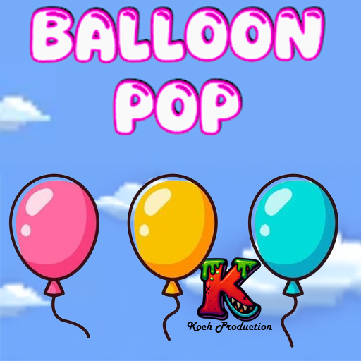
Balloon Pop – Pop Frenzy is the published Android game in the Dinks Gaming portfolio. Its presented loop includes popping balloons before they escape, increasing speed, skins, upgrades, and score chasing. The ideas below examine those features at a design level. They are not a claim about hidden scoring rules or a guide to an unverified upgrade strategy.
Make the first pop unmistakable
The first interaction teaches what the game considers a successful action. A visible target, a clear response to a tap, and immediate feedback establish that relationship. The player should not need to wonder whether their finger missed, the game delayed, or the balloon was not interactive.
Coordinate the visual and audio response around the moment of contact. A pop animation can be playful, but should not make the successful result hard to read. If the target remains on screen while an effect plays, its state needs to be clear so players do not repeatedly tap something already resolved.
Start with enough space to recognize the response. The first moment can demonstrate the loop before speed and density create pressure. A game with a small set of controls still needs onboarding because understanding the consequence of an input is part of learning. A concise successful interaction often explains more than a screen full of instructions.
Treat the target area as a design decision
A balloon’s artwork and its interactive region are related, but they are not automatically identical. A very small visible target may be difficult to tap consistently on a phone. A generous region can help, but overlapping regions can make the selected target unpredictable.
Test with fingers on real devices early. A mouse click offers precision and visibility that a thumb does not. Fingers cover the target at the moment of input, so feedback around the contact point can be easier to perceive than a change entirely beneath it.
Mobile touch control design explores spacing, reach, and feedback in more depth. For a popping loop, the practical question is whether players can intentionally select the balloon they meant to pop. Difficulty should come from the game’s intended timing and attention demands, rather than from an invisible mismatch between the image and its interactive area.
Escalate pressure through readable changes
Increasing speed can create a clear sense of rising challenge. It also changes the time available to notice and act. Review whether balloons remain identifiable as the pace rises. If a target crosses an important area too quickly to perceive, more speed may stop producing useful decisions.
Density, route, and timing can also change pressure. Introduce these changes deliberately rather than increasing every variable at once. A player should be able to understand why a later moment is more demanding. That understanding helps them form a strategy for another attempt.
Watch for clutter from successful actions. A celebration effect that lasts too long can cover the next target. At higher speeds, feedback may need to be shorter or more focused so the game remains readable. Animated website performance planning examines a related presentation problem: movement and visual feedback need a budget instead of competing without limits.
Make a missed balloon informative
A miss should have a clear outcome. The player needs to know whether the balloon escaped, the tap landed elsewhere, or a particular target required a different action. Without that distinction, they cannot tell what to improve.
Keep the explanation proportional to the pace. A quick visual indicator may be enough for an ordinary escape. A special condition may need a short introduction before appearing in a demanding situation. Stopping the game for a large message after every miss would break the rhythm.
Observe the player’s interpretation after a round. Can they describe the mistake that ended it? Do they know which targets they failed to notice? Actionable playtest feedback helps separate a difficulty preference from an input or communication problem. Someone wanting an easier round differs from someone whose taps repeatedly produced an unexpected result.
Give upgrades an understandable role
An upgrade is useful when the player can connect its description to a change they experience. The description should explain the effect in practical terms, with enough detail to compare options. A vague label may sound exciting while leaving the choice arbitrary.
Show the current state and the consequence of a purchase before commitment. If an upgrade affects a future round rather than the current one, make that timing clear. This helps players distinguish permanent progress from a temporary result.
Avoid making the opening loop depend on understanding every upgrade. First establish what popping and escaping mean. Upgrades can then offer a way to pursue a personal goal. Solo project scope is relevant here because every upgrade adds description, interface, balancing, and testing work. A small set of distinct effects is often easier to explain than many nearly identical choices.
Keep skins distinct from functional promises
Cosmetic variety can make repeated play feel personal. It should be clear when a skin changes appearance and when an option affects gameplay. Mixing the two without explanation creates uncertainty about what a player is choosing.
Review visual readability across skins. A beautiful color treatment can become hard to see against a particular background. Shape and contrast should preserve the target’s identity, especially during fast movement. A cosmetic should fit the activity rather than requiring players to relearn what can be tapped.
Consider the selection screen as part of the loop. Show enough of the skin to make the choice enjoyable, then provide a quick return to play. Repeatedly navigating several screens between short rounds can turn personalization into friction. The player should be able to enjoy a new look without losing the desire to try another score.
Make the next attempt a useful choice
The end of a round is an opportunity to show a result and suggest another attempt. A score, personal best, or concise summary can tell the player what happened. Keep the primary next action clear rather than surrounding it with several competing prompts.
A quick retry supports learning because the previous attempt is still fresh. Let players change a relevant choice if they want, but do not require unnecessary setup every time. Replayability design examines how repeated attempts stay interesting through mastery and meaningful variation.
The Dinks website also includes a small balloon challenge inspired by the Android project. It is a separate website activity, not the full mobile game. That distinction belongs in presentation and links: someone enjoying the small challenge should be able to reach the official Android game page and understand where the complete experience lives. Clear expectations strengthen the loop from discovery to play as much as clear feedback strengthens a single pop.
Review one crowded moment
Choose a moment in which several balloons and a successful pop effect are visible together. Ask which target the player should notice next and what confirms the previous success. If the effect covers the next target, shorten or reposition it before making the target easier.
Then observe an intentional miss. The player should be able to distinguish the escaping balloon from the result of a tap that landed elsewhere. These two short situations examine different parts of the loop: visual attention and input interpretation. A change that fixes one may not fix the other. Keeping the review specific helps preserve the energetic pace while improving the clarity that lets players enjoy it.